Dear Colorado Convention Center:
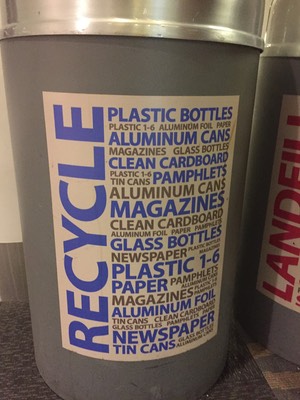
I’m as much of a fan of text graphic treatments as the next recovering English major, but I’m not interested in reading in-depth trash and recycle bins. I know, you’re shocked by this.
It’s just not a fun hangout spot, really. It can be a little smelly, people are crowding around, trying to get rid of their stuff, and no one is reading your 50-word essay on recycling, let alone the three bin recycling-landfill-compost trifecta. Literally (yes, I know what that means. See the English major reference above) no one.
So people are mostly
1) Guessing, possibly wrongly, resulting in added processing expense or
2) Shrugging and putting everything in Landfill because they can’t be bothered
Neither of these outcomes are good, Convention Center!
They’re both likely to increase costs and landfill contributions, and I’m pretty sure that is exactly the outcome you were trying to avoid.
There are two overall usability issues here:
1) We need to put context before aesthetics.
This is not to say we need to forget aesthetics altogether, just that we need to acknowledge the setting of our information. For example, something this long on the door of a bathroom stall is fine, I’ve got time to read and I’m a pretty captive audience for a few minutes. But on a bin, where my goal is to shed my trash/recycling and move on about my convention, I want to be able to make as efficient a decision as possible. Your verbosity doesn’t make me contemplate your artful graphic, it just makes me decide faster and more inaccurately.
2) We need enough humility to look at what other people have already done.
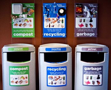
Not everything functional has to be unique. I know, tell it to the toothbrush designers. But there’s no shame in taking a few minutes and looking around at what other folks are doing, then adding your own style to it. For example, this is how they do it at UCSF Mission Bay. It’s easy to stand there with my lunch and visually/quickly/efficiently figure out where everything belongs.
If you want to make it Colorado-esque, present the images in a triangle design to echo the airport and the center itself. Do a graphic of a juggling blue bear, where he’s juggling the appropriate items on the appropriate cans. World’s wide open for you, once you recognize that ultimately you’re putting design energy into an object that people want to interact with for an absolutely minimal amount of time.
It is what it is. But you can tell people about it in a much better way.