Counting on Pedestrian Telepathy is Bold. Maybe Too Bold.
Dear Park Meadows Mall:
A few months ago, I had gone shopping at the mall, and then decided to cross the street for a little lunch without moving my car. It seemed like a reasonable thing to do, especially given that you’d provided this handy dandy crosswalk.
But . . . .
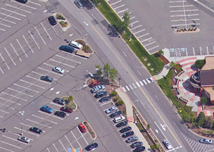
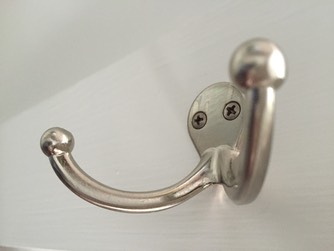
The crosswalk itself is . . . bold. Very bold. Below is a closeup of the crosswalk.
When you’re a pedestrian, you come up to the pole, and push a button. This apparently triggers the lights, which are DIRECTLY ABOVE YOU to flash. You can’t see them flashing, and there’s nothing pointed at you-the-pedestrian to indicate when they start and stop.
You’ve got the red bumpy surface on the slope down to the crosswalk, which is very blind-person friendly of you. BUT you don’t have the sound to indicate when the light is flashing at the cars, so that is not so blind-person friendly. And it doesn’t help those of us who are figuratively blind because we have absolutely no idea when it’s safe to cross.
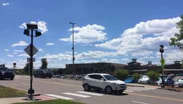
This is all made more exciting because - as you can see in the top photo - the crosswalk is really near an entrance to the mall road, so people are coming fairly quickly around the corner and don’t have good visibility before they need to slow down.
So here I am, a pedestrian who has pushed a button to trigger the flash of a light I cannot see which will presumably stop the cars which can’t see me. My best bet seems to be to telepathically scream STOP while frantically crossing.
You can see, dearest Park Meadows, why entering this crosswalk is more of an act of faith than the average tired and hungry shopper might want to take on. Please consider the non-telepathic pedestrian in future designs.
Full Spectrum of Users: Taking the Color Blind into Account
Dear Designers of sites and software that might be used by men (which should be a fair number of you):
In many ways, differences in ability are much easier to cope with in these modern times. Assistive technologies and rights legislation have spurred great progress. But though it’s a common challenge, color blindness hasn’t had a lot of assistance or advocacy. We’ve always known that pilots need full color vision to make distinctions between the colored lights on a runway, but otherwise it doesn’t get a lot of attention.
In the information age, much of our lives depends on our ability to interpret and react to complex data presentations, and being color blind can make that interpretation harder. About 8% of men and .5% of women have some degree of color blindness, the most common type being red/green deficit. There are also blue/yellow deficits and other issues that can limit people to as few as 20 hues in their visual spectrum. While it’s an important difference in ability, it often gets lost in the range of design considerations.
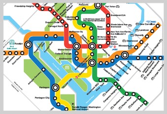
Here is the Washington, DC subway map. Can you tell the difference, at a glance, between the red and green lines on the red/green color blindness map? What about the orange line and the greenway that goes behind it? People who live with this spectrum have learned to pick up on very subtle differences to make the distinctions that many designers and information architects take for granted. But some changes in tone and intensity could easily make this map more readable for that 8%.
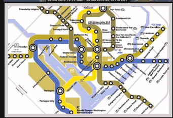
In this map, the highs and lows look very similar in red/green color blindness. This is a GREAT map, (found at Science Daily) with useful environmental information from SUNY ESF. It just needs a slightly different color scheme to be readable by everyone.


When we talk about designing for Section 508 compliance, we’re talking about making sure that people across a range of abilities have access to the data they need to make decisions, do their jobs, and find their way around. Color blindness affects a huge percentage of the population - 4.5% of your potential users, or 280 million people in the world. This is higher than almost any other ability that might find use of your site or software challenging.
There are great sites for making sure that you are respecting this population:
http://colorfilter.wickline.org is how I rendered the images shown here.
http://www.vischeck.com has always been my favorite for checking this information, but their web-based checker is currently unavailable. They do have a photoshop plugin to make it as easy as possible for designers.
There is now assistive technology for color blindness. Enchroma now makes glasses that provide a more full-spectrum experience. If you want to give yourself a spiritual gift, all you full-spectrum seeing designers, go to their YouTube channel and watch the videos of people seeing color for the first time. Then revel in your color vision, the spectrum at your disposal, and the beauty you can see. Just remember these folks when you’re doing your designs.
Believe It or Not, I Don’t Want to Read a Recycle Bin For Ten Minutes
Dear Colorado Convention Center:
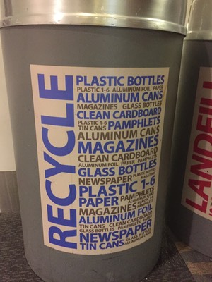
I’m as much of a fan of text graphic treatments as the next recovering English major, but I’m not interested in reading in-depth trash and recycle bins. I know, you’re shocked by this.
It’s just not a fun hangout spot, really. It can be a little smelly, people are crowding around, trying to get rid of their stuff, and no one is reading your 50-word essay on recycling, let alone the three bin recycling-landfill-compost trifecta. Literally (yes, I know what that means. See the English major reference above) no one.
So people are mostly
1) Guessing, possibly wrongly, resulting in added processing expense or
2) Shrugging and putting everything in Landfill because they can’t be bothered
Neither of these outcomes are good, Convention Center!
They’re both likely to increase costs and landfill contributions, and I’m pretty sure that is exactly the outcome you were trying to avoid.
There are two overall usability issues here:
1) We need to put context before aesthetics.
This is not to say we need to forget aesthetics altogether, just that we need to acknowledge the setting of our information. For example, something this long on the door of a bathroom stall is fine, I’ve got time to read and I’m a pretty captive audience for a few minutes. But on a bin, where my goal is to shed my trash/recycling and move on about my convention, I want to be able to make as efficient a decision as possible. Your verbosity doesn’t make me contemplate your artful graphic, it just makes me decide faster and more inaccurately.
2) We need enough humility to look at what other people have already done.
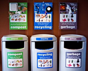
Not everything functional has to be unique. I know, tell it to the toothbrush designers. But there’s no shame in taking a few minutes and looking around at what other folks are doing, then adding your own style to it. For example, this is how they do it at UCSF Mission Bay. It’s easy to stand there with my lunch and visually/quickly/efficiently figure out where everything belongs.
If you want to make it Colorado-esque, present the images in a triangle design to echo the airport and the center itself. Do a graphic of a juggling blue bear, where he’s juggling the appropriate items on the appropriate cans. World’s wide open for you, once you recognize that ultimately you’re putting design energy into an object that people want to interact with for an absolutely minimal amount of time.
It is what it is. But you can tell people about it in a much better way.
Pop Classroom: Denver Comic Con Site and App
Dear Pop Culture Classroom:
You do great work. I love the work you do. I love your use of comic books to improve literacy among kids and incarcerated folks.
But app design is not your strength. There are so many things we could talk about. We could talk about getting a login for the site, and then have no way to enter that login on the app once you download it to your phone. So I end up not having a login for the app because I didn’t want to create a second one. We could talk about how there doesn’t seem to be any relationship between guest categories, panel categories, and icons. We could talk about whether or not an apocalyptic event would occur if you were to link a guest name to their Wikipedia page. We could even talk things that are a little better than last year - I think the street level map is improved.
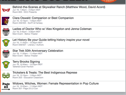
But let’s focus on one concept, one tiny but fundamental concept: the creation of a favorites list for planning your day at Comicon. Because there are a dozen panels going on at offset times, and it’s hard to get through a day and not miss some really good stuff without a little planning. And there is good stuff at Denver Comicon.
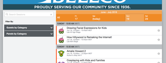
Step One (which I’m doing on the website due to login problems, see above) Find the day’s events.
On the top navigation, it’s two clicks to the schedule, one click to tomorrow. Not bad. But once I’m in “The Show," that navigation is replaced with Pop Classroom navigation, and the only way back to this navigation is to re-enter the URL. Hopefully there’s nothing useful anywhere else there.
Because I’m focused on making the most of the day, I’m not seeing anything but the calendar. It’s the primary activity, I would bet, for most show-goers, once the event starts.
(On the app, schedule is the 6th option down, not present on the first screen.)
Anyway . . .
Cute but meaningless icons, no ALT tag, no key at the bottom. The meaning might be somewhere else, but I’m not browsing here, I’m trying to accomplish a task. (This is one of my many icon-related thoughts: Is that green thing a steampunk meets Georgia O’Keefe style reference to lady parts? Are those the girl geek talks, clearly delineated for my scheduling pleasure? If so, is that creepy or cool?)
And I’m guessing the little stars mean things I can favorite! Good news, because this list is totally long.
Step Two: Find My Favorites
So now I painfully work my way through the list. There is no way to get more information on a session within this page, I have to go to another page, and then back. if I want to know who someone is, because I don’t recognize them, I have to click again. There’s no breadcrumb, so I have to navigate back manually.
After about 45 minutes of this, counting the second browser tab where I’m checking people who don’t have biographies with their Wikipedia entries, I have a list of favorites. Wahoo! So where are my favorites?
They’re mine, my personal subset, so I figure they’re under my profile. Nope, not there. But there is an “Export Favorites” option, maybe it will open them up so I can see them. Nope, it just downloads a file that it doesn’t show me, tell me the name of, or give me any control over. Goodie. So where could they be on the site?
Yup, this central activity, this common task, this list I just finished personalizing, in exchange for which I gave you personal information, is under “More.” Naturally.
But it is there! Wahoo again! I am close to having a personalized list of activities so that I can plan my day . . . right? Right?
NOT REALLY. Because you, using logic that is pretty exclusive to your own self, have given me my list in alphabetical order.
Who on earth, who on any planet, (since we’re being all Con-ish) wants to see a schedule in alphabetical order? Is this the way you are organizing your lives, you poor dear things? Because if so, please consider changing to chronological order. It could be that you are missing out on some great things in your life because you have no idea what is happening when.
Get better soon, we need you.
P.S. The “Export Favorites” function gives me this non-functional list. Well, it is functional, but only if the WiFi at the Convention Center is working. Which it wasn’t yesterday . . . Seriously, get better soon. We need you.

Hotel Room Air Conditioning
(Privilege disclaimer: I am so lucky to live in places with air conditioning as an option. We have a lot of capital P Problems to fix in this world. These letters are about lower-case problems that amuse/annoy me, not the big ones that wake me up at 3 am. To see a cool solution to capitol P air conditioning, watch this video. If you, like me, get overwhelmed by the bigness of the capital P Problems, join us.)
Anyway, back to the little issue of hotel room air conditioning.
Dear Hotel/Motel Designers,
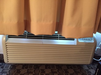
Here we are, my family and I, checked into a middle-level hotel in a hot area. The windows, of course, don’t open. The room is warm, and we sleep better if we’re cold. As do, in fact, most humans. But we want the curtains closed, because humans also sleep better in the dark.
So we turn on the air conditioner, which then proceeds, with enthusiastic grunting, to cool . . . the curtains. And it will cool them with thoroughness and exuberance all night long, unless I use the hotel guidebook for a purpose that it was not intended, and prop it up against the curtains so that at least an 11 inch portion of the 30 inches of air conditioning is headed to the room.
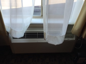
My theory is that the designers of hotel rooms like this sleep in nicer ones with central air, and only visit these during the day. And during the day, the whole curtain/air conditioner thing is completely different. The curtains are open, or only the sheers are pulled, so the air wafts beautifully around the room, regardless of the corresponding beauty of the furnishings or over-the-bed oil paintings.
We need a curtain holder - a bar installed on the wall that we can lower to pinch the curtains back, a cage over the air vent that opens and keeps the curtains at bay. Some sort of designed equivalent to the hotel guide propped against the window.
Because if we who are lucky enough to have power and hotels and air conditioners can figure out how to use them more efficiently, it will help this little problem, and it will start to help the big Problem of energy consumption and climate change.
Dressing Room Hooks
Dear Clothing Stores Everywhere:
Three Dressing Room Hooks. That’s All I’m Asking. Three.
Sure, lighting that doesn’t make me look like a nauseous zombie hippo would be great as well. And maybe stiff drinks, if I’m trying on jeans and/or swim suits. And some soft jazz to muffle the collective grunts of pulling things on and reaching for zippers. But those things are probably for better stores than I can afford.
So back to the three hooks.
One for the stuff I haven’t tried already.
One for the stuff I’ve tried and am planning to buy.
One for the stuff I’ve tried and am not planning to buy.
If you really love me, give me a 4th hook for the maybes and/or my purse and/or the clothes I came in with. But three would be enough to make me happy.
Now, I know you’re only letting me try 6-8 things on at a time anyway, and in your mind, you think I can keep track of them without additional hookage. You’re adorable. I suspect your mind doesn’t have a list of mom/small business owner/caregiver things cluttering up the corners and oozing into the doorways, or you would know better. I am functioning on the edge of chaos, mentally, most of the time. Your three-hook contribution to the control of my day will be more appreciated than you think.
This is a classic case of an interface that is designed by people who a) don’t apparently use it and b) don’t apparently talk to anyone who uses it.
It’s also a classic case of ROI. For one more hook, you make me happier in your dressing room. And happy people spend more. Happy people like the way they are treated, and have a good experience with your brand, making it more likely they’ll come back. Happy people are willing to try more on, to come back to the dressing room and use it again, and again, to buy more.
Now about the lights . . .
Wait, Which Number?
Dear @JeffcoColorado:
I actually don’t think paying taxes is a terrible thing. I like roads and schools and streetlights and parks and firepeople. But I think there are some ways to make it less painful, even for those of us who don’t walk into the process with chips on our shoulders.
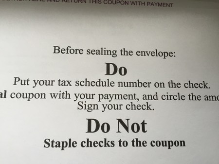
This is what the envelope says on the outside. On the document, there are 3 clearly labelled numbers:
PIN
TAG
Bill #:
So follow the radical usability lady here. Stay with me.
Use the same vocabulary on your instructions that you use on your document, so that users can comply with the request you are making.
I chose at random from the three numbers available to me, because I cannot tell which one you want.
This will not change the world. It won’t make people love paying their taxes, especially the ones that aren’t big road/school/firepeople fans. But it will make things just a little easier, a little faster, a little less of a burden. It will make them feel a little more like you’re taking them and their time into account.
It couldn’t hurt.